When was the last time you re-evaluated how your home contributes to your mindfulness and calmness? Our emotional responses to colour aren’t just imagined. Using a calming colour palette is one of the most effective ways to develop a tranquil home base on a budget.
Softer shades of blue, purple, pink and green, including all sorts of pastels and neutrals, are psychologically comforting. Below, you’ll find a helpful round-up of some colour recommendations to help you along your journey to creating a more tranquil, mindful living space.

Refreshing and reassuring, green promotes a sense of peace and supports positivity and balanced emotions.

Purple contributes to a sense of authenticity and regal confidence. It’s also a liberating shade, promoting meditation and encouraging heightened spirituality.

The undertones in light brown, beige and tan neutral colours make them welcoming and warm. You may be subconsciously more relaxed while surrounded by the shades in this colour family.

Pink brightens the appearance of a room, making it more expansive and warmer. Shades of pink also contribute to a happy, carefree vibe.

Gray is the ultimate calming colour, but it’s extremely underrated. Cool grays can make a space feel enveloped in a peaceful, elegant vibe.

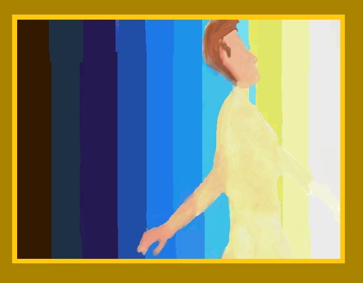
One of the best parts about blue is that certain shades are dreamy and serene, while some variations of the colour lend themselves to boosting clarity and productivity.
An easy, intuitive and fun process
Colour psychology is easy, intuitive and fun. You might even notice that you gravitate to soft pastel and neutral colours when you’re stressed or feeling uncertain. You’re bound to feel comforted and nurtured by certain colours, whereas different vibrant hues can give you a burst of clear-minded inspiration.
Hopefully, you can walk away from this article with some ideas as to how to create the best possible Zen environment for your home by using colour.
«RELATED READ» COLOUR MANTRA: Use this visualization technique to energize, relax and centre yourself»
image 1 Image by garageband from Pixabay 2 all other images via author courtesy of Siege Media